In the Absence of Sight


JesRoseDesign-2664.jpg


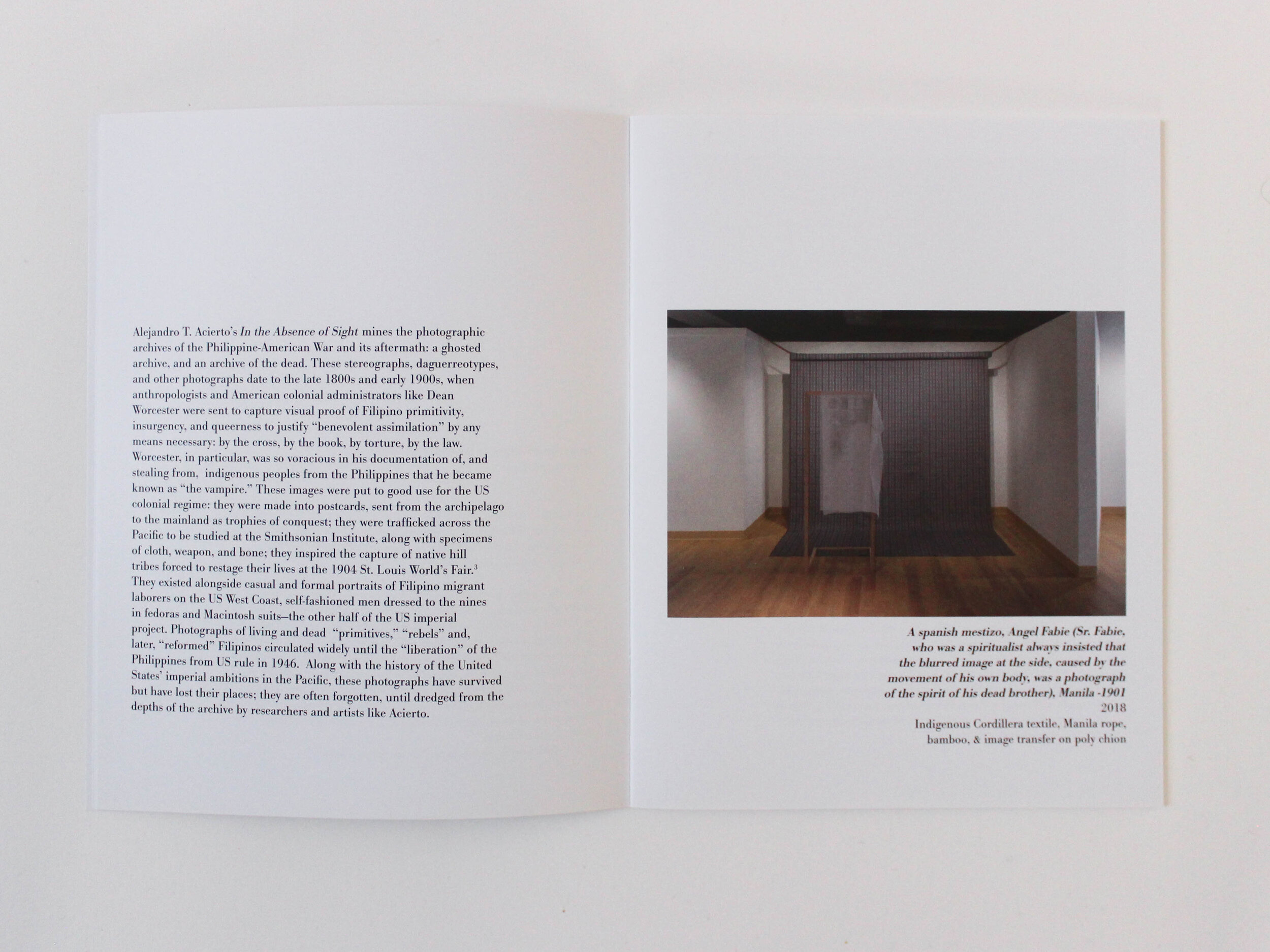
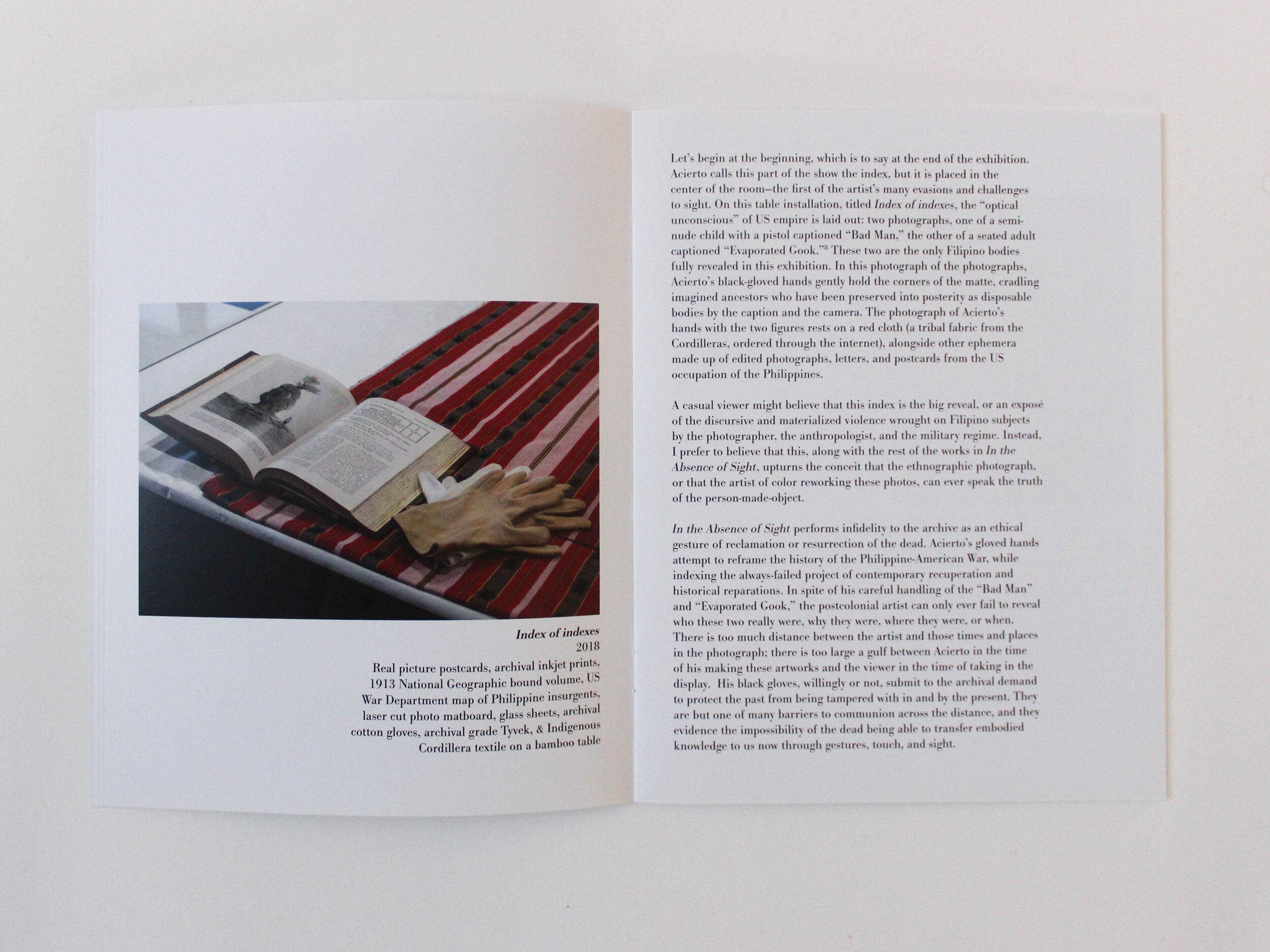
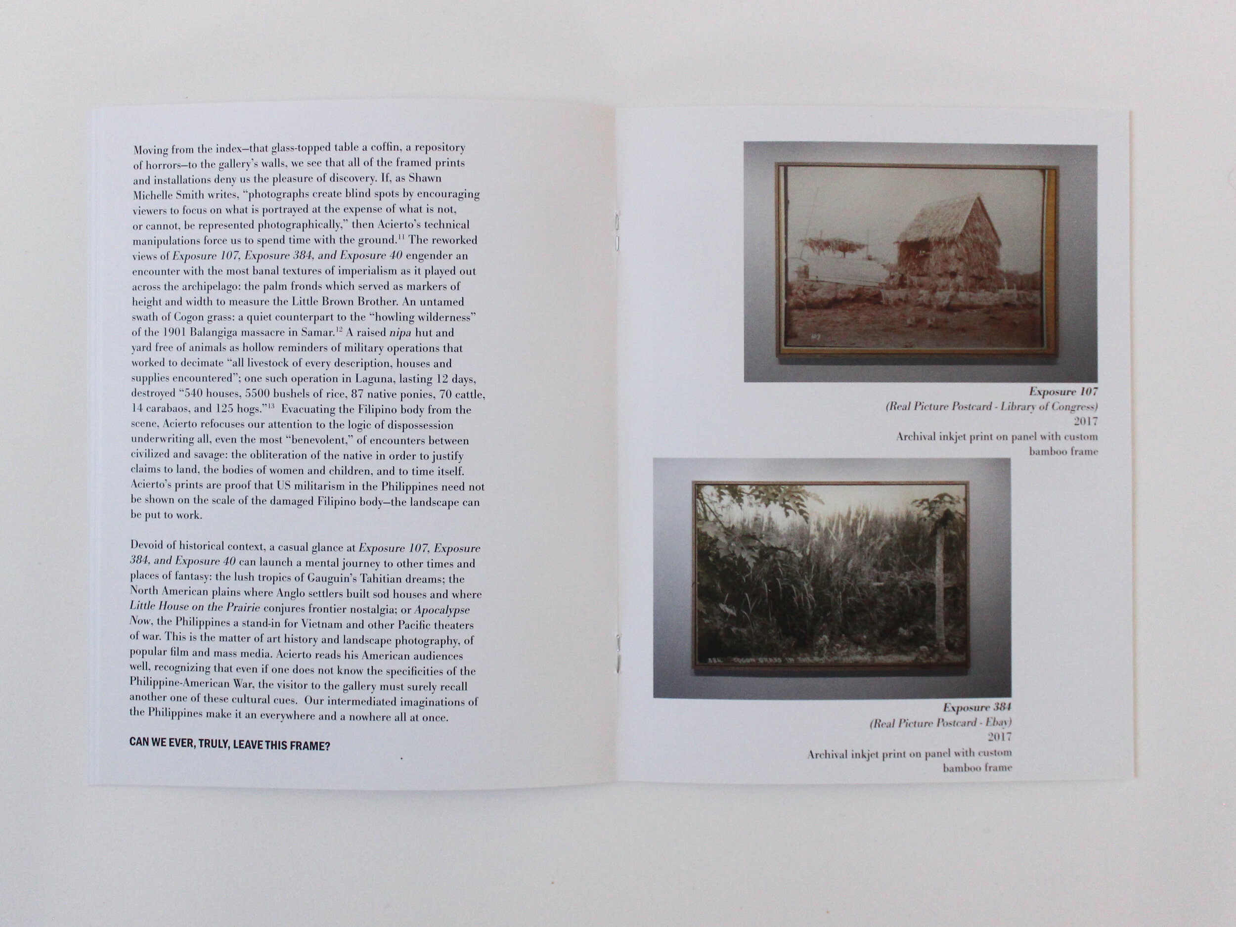
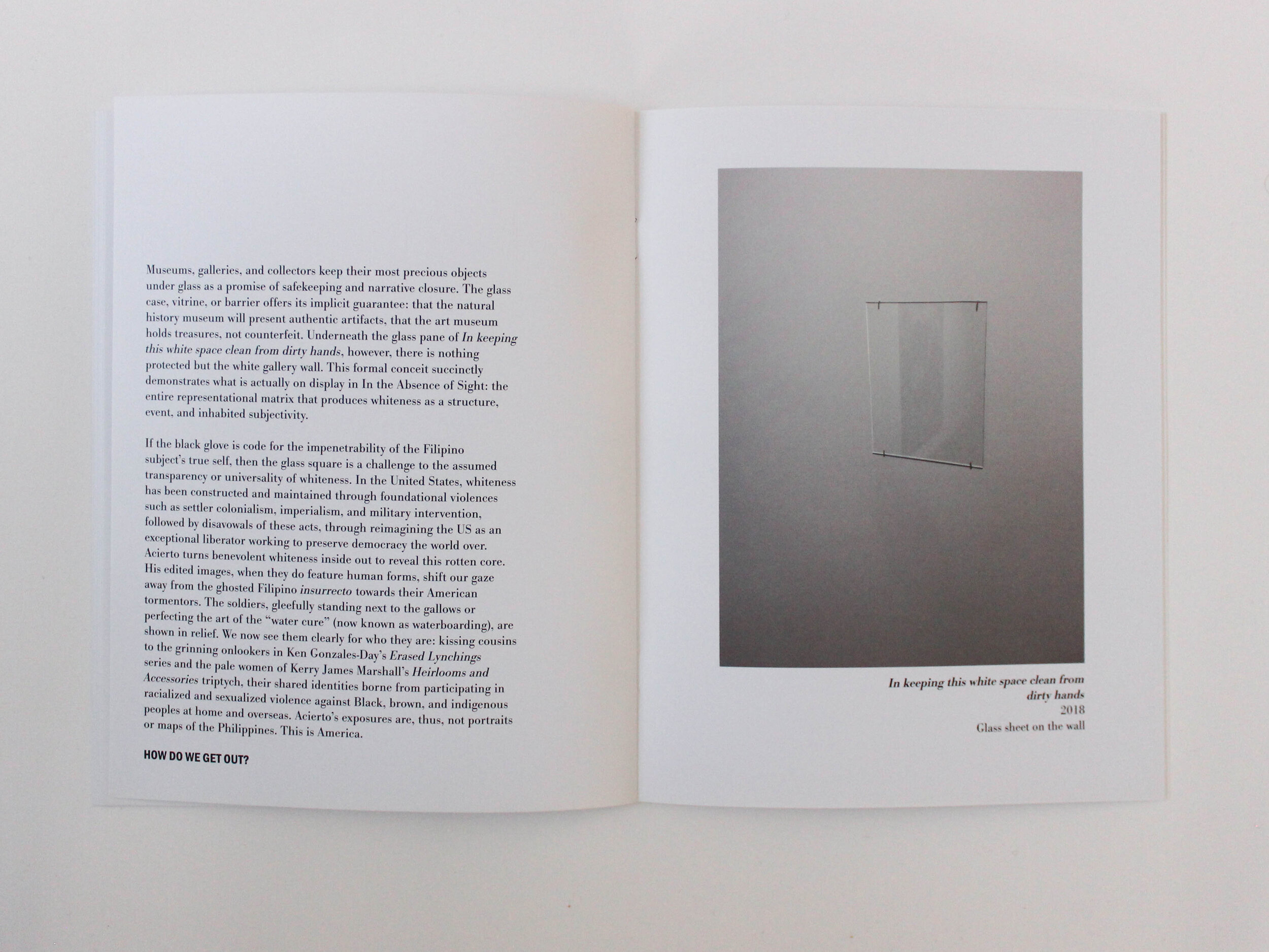
In The Absence of Sight, an exhibition by Alelejandro Acierto, centers on the erasure of the Indigenous Philipinx. The ghosts of a people group. The absence.

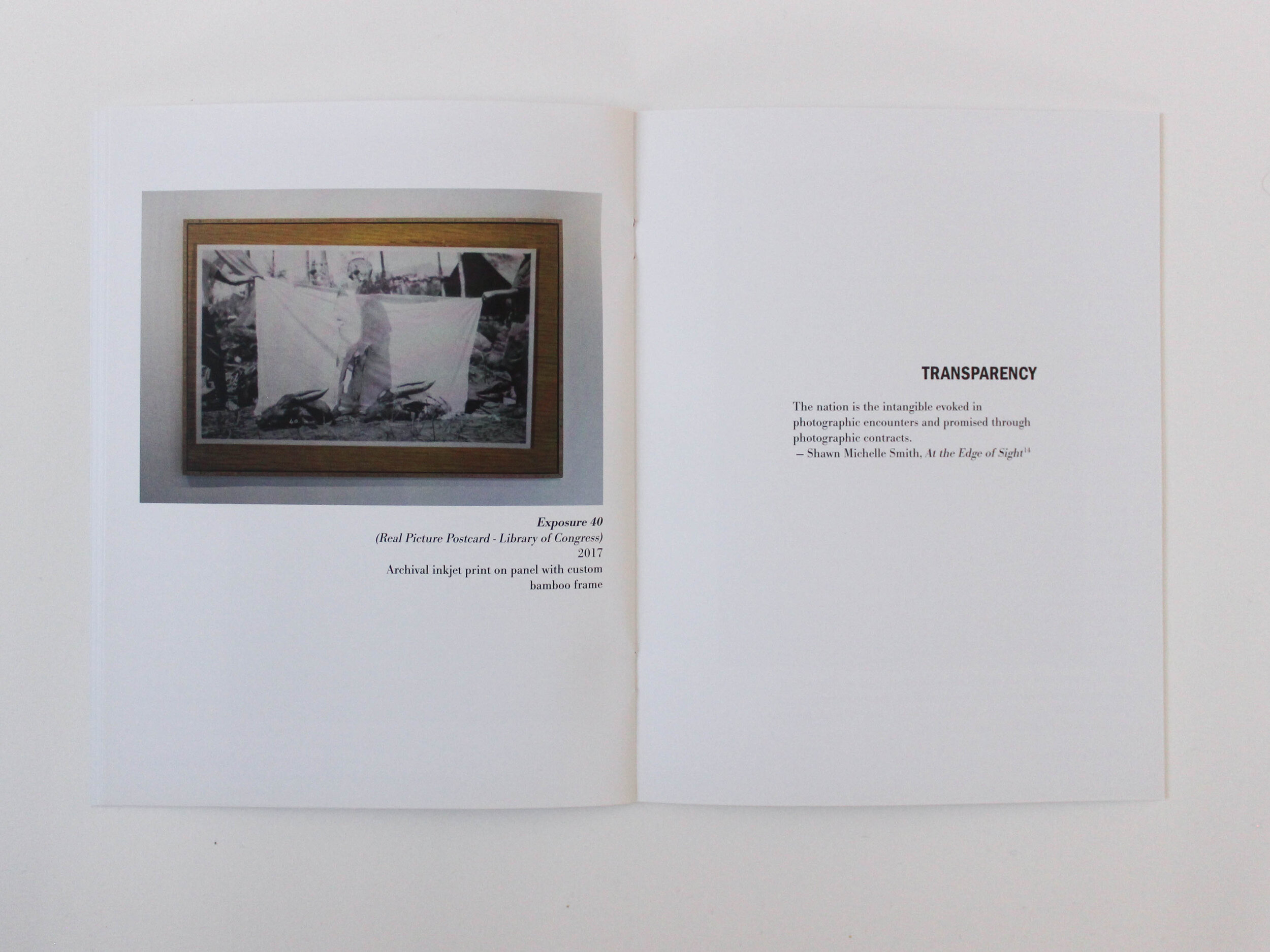
The design of this catalog and the exhibition branding focus on creating something that felt like it was missing - gone but still there, a ghost. The blind emboss on the cover, clear vinyl on the gallery windows, quotes floating in the middle of blank pages, and strong questions left hanging at the bottom of pages, all seek to emphasize this idea.
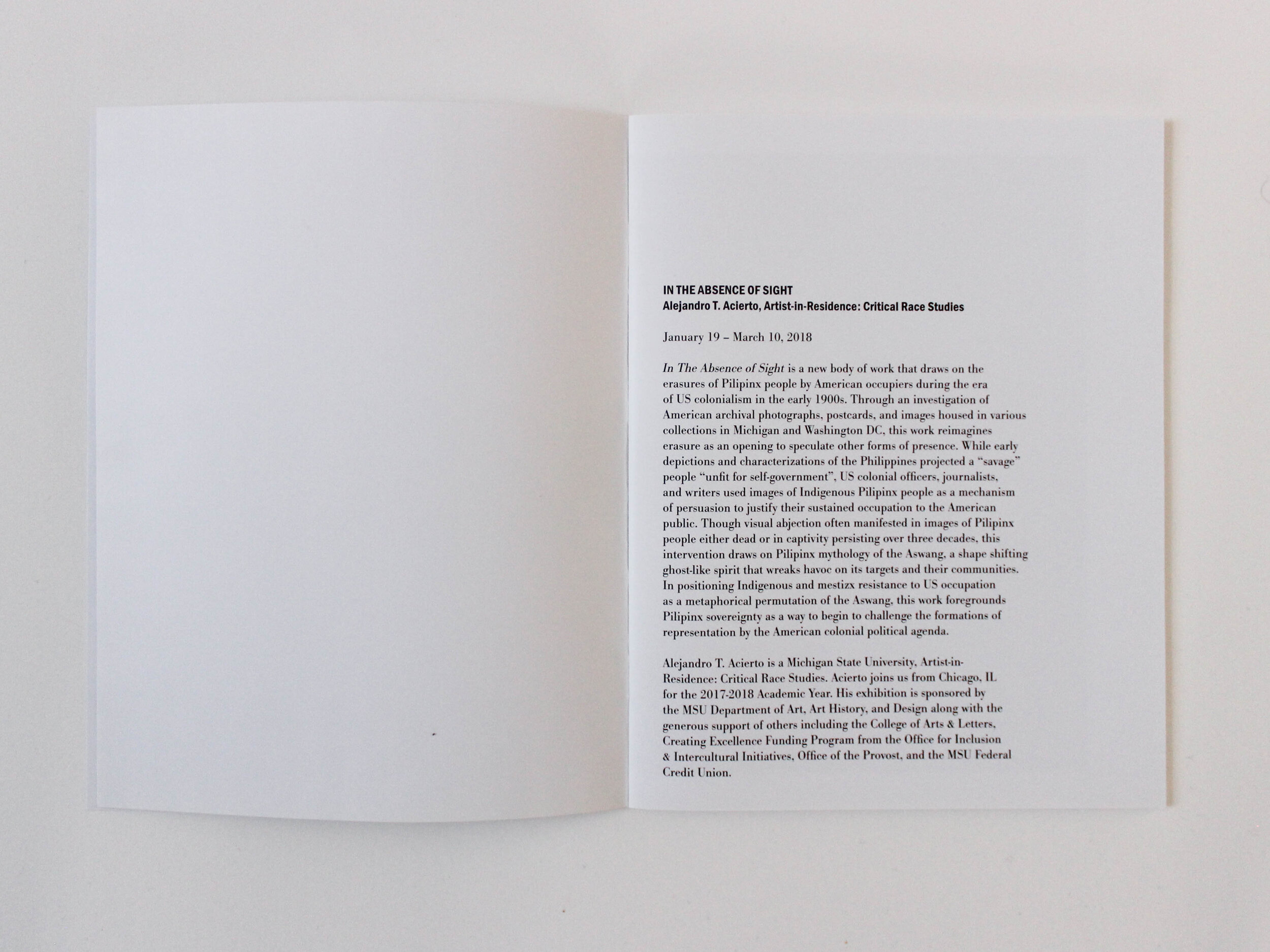
Project Includes:

Digital Content:

  • Social Media Elements (Instagram + Facebook)

  • Digital Poster

  • Email Campaign

Print:

  • Catalog

  • Gallery Branding

  • Exhibition Postcard

JesRoseDesign-2661.jpg
 

Digital Elements:

To translate print to digital, the blind embossed title was turned into a light grey, balancing the lowest opacity possible with legibility, depending on the specific output.

sight_tv.jpg
AA_insta-04.jpg

Minimal Eucalyptus Green Invitation Suite


Included In this Suite:


Wedding Stationery:

  • Cardstock

  • Floral Illustration

  • Digital Addressing


Other Stationery:

  • Bridal Shower Invitations

  • Save Our New Date Card (Covid-19 Postponement)


Day of Items:

  • Menus

  • Vow Books

  • Table Numbers

  • Welcome Sign

  • “Cards and Gifts” Sign

  • Place Cards


Bridal Shower Invitation

JesRoseDesign-4122.jpg
JesRoseDesign-4119.jpg
JesRoseDesign-4121.jpg
 
JesRoseDesign-4072.jpg
JesRoseDesign-4029.jpg
JesRoseDesign-4012.jpg
JesRoseDesign-4020.jpg

Custom Floral Illustration

JesRoseDesign-3564.jpg
JesRoseDesign-4010.jpg

Second Wedding Invitation for Postponed Reception

Day - Of Stationery

Lavender Garden Wedding

Isabella + Frankie


Included in this suite:

Wedding Invitation Suite:

  • Cotton Paper

  • Floral Illustration

  • Illustrated Map Card

  • Venue Illustration

Embellishments:

  • Vellum Wrap

  • Wax Seal + Paper Twine

  • Digital Addressing

  • Vintage Postage

Day Of Items

  • Vow Books

  • Seating Chart

 
JesRoseDesign-3682.jpg
JesRoseDesign-4171.jpg
JesRoseDesign-4207.jpg
JesRoseDesign-4189.jpg

Cotton Paper

JesRoseDesign-3712.jpg
JesRoseDesign-3686.jpg

Illustrated Map Card

JesRoseDesign-4214.jpg
JesRoseDesign-4156.jpg
JesRoseDesign-4157.jpg

RSVP Card + Envelope

JesRoseDesign-4160.jpg
JesRoseDesign-4151.jpg
JesRoseDesign-4224.jpg

Personal Floral Illustration

JesRoseDesign-3684.jpg

Vellum Wrap with Wax Seal & Twine + Vintage postage

JesRoseDesign-4228.jpg
JesRoseDesign-4170.jpg
JesRoseDesign-4117.jpg
JesRoseDesign-4148.jpg

Vow Books

JesRoseDesign--2.jpg
JesRoseDesign-4257.jpg

Figuring it out

What is design? Why does it matter? How does one make meaningful work?  How do *I* learn to make meaningful work?

This 60 page, unbound book is a snapshot of a small notebook that I carried around everywhere I went from December 2016 to March 2016. It is a book of questions and lists and lists of questions. Of quotes from books and professors and speakers and movies.  Research of my own and other artists and scientists and writers.  Maps and drawings and flow charts. 


This book is part of an ongoing project to discover why design matters and my role in the world as a graphic designer. So far, I have learned that sometimes the best thing to say, "I don’t  know. I don’t know what it is or why is matters. Yet."

Play By Eye – Photography

“I play by eye in the same way that musicians play by ear”


Musicians listen to notes and create compositions, following an code, unknowable for

the rest of the world. Music evokes feelings and emotions that are beyond words. The

rhythm and pattern of the each instrument playing together to create an symphony that

when other hear, creates inexpressible feelings. It is a language entirely beyond words.


“I play by eye in the same way that musicians play by ear”


Color is the language that I most naturally think and feel in. Rather than gravitating to

words or music to express my thoughts, I find that complex color combinations most

clearly display what I am feeling. This book highlights the complex relationships built

within colors and the hues that create the colors. This book is not created by using a pattern or a linear structure. It is built by intuitively placing images and colors,highlighting the true color of our world.

Does It Matter?

The 5 inch by 5 inch book is created by printing concentric circles on transparencies. The CMYK values of each color is separated on to different pages of transparencies, so that when the viewer turns the pages, they are able to essentially deconstruct the color. This color manual brings questions of value and importance to the surface, but instead of presenting the viewer with answers or opinions, the body of the book is entirely void of text, creating a situation for the viewer to think about the questions independently. There are 20 sets of concentric circles within the book.


60 acetate pages, 20 card stock pages. Inkjet printing.